The objective of this project was to promote tourism by creating a modern, fun, and appealing brand identity for Sedona, Arizona that also incorporated the Southwestern style traditionally associated with the city.
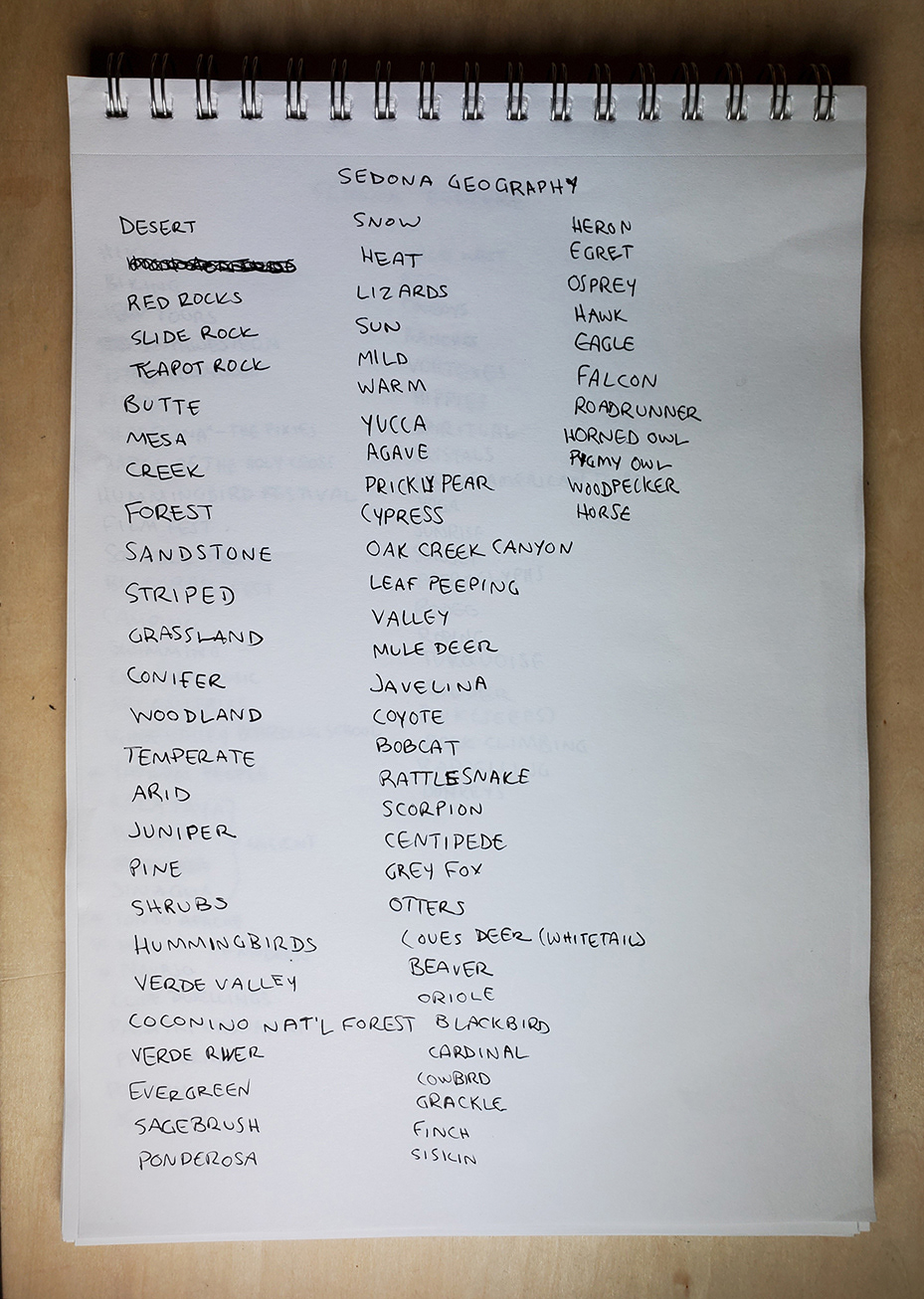
Before beginning to design Sedona's logo, I extensively researched the city, including its history, geography, flora & fauna, and current attractions.
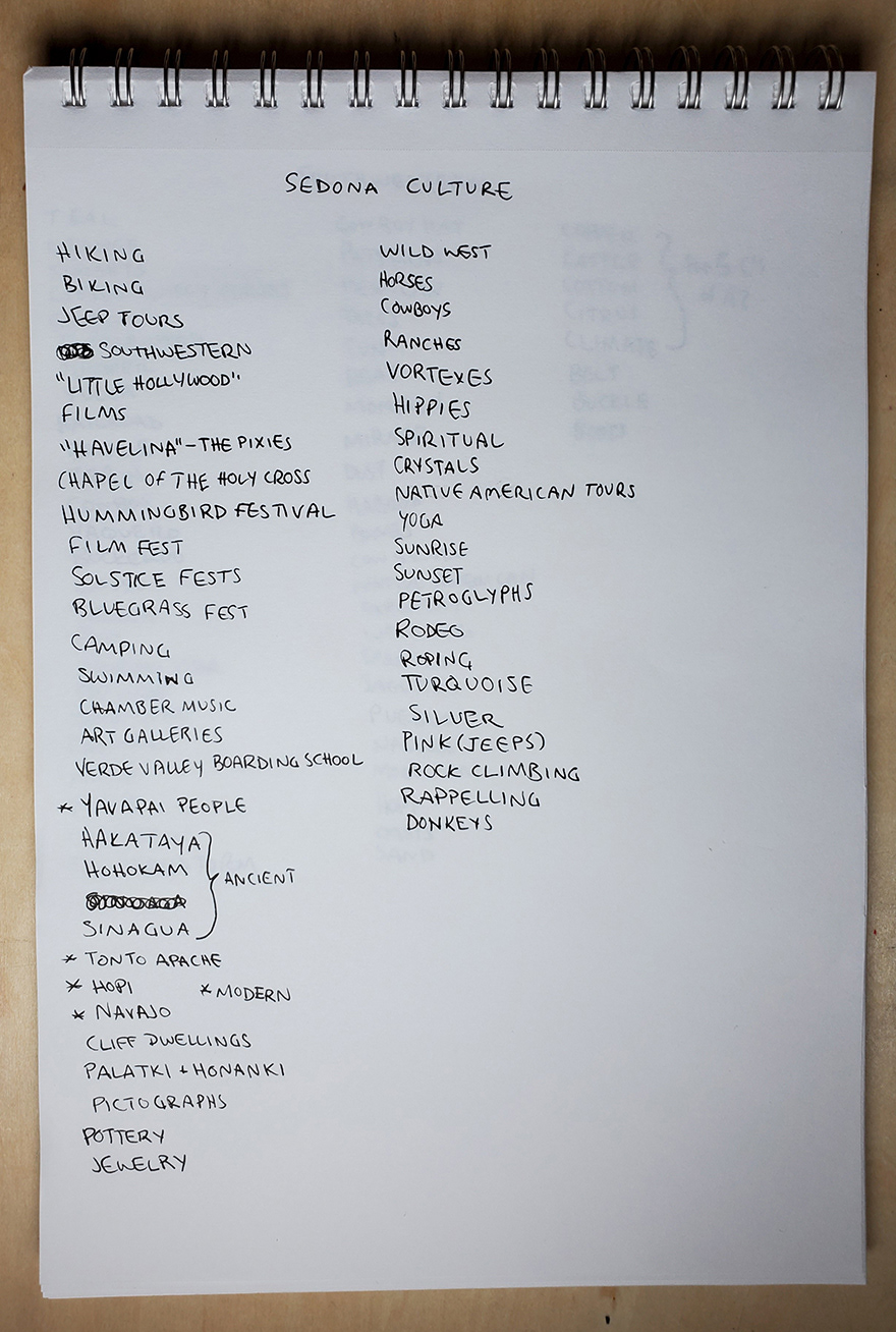
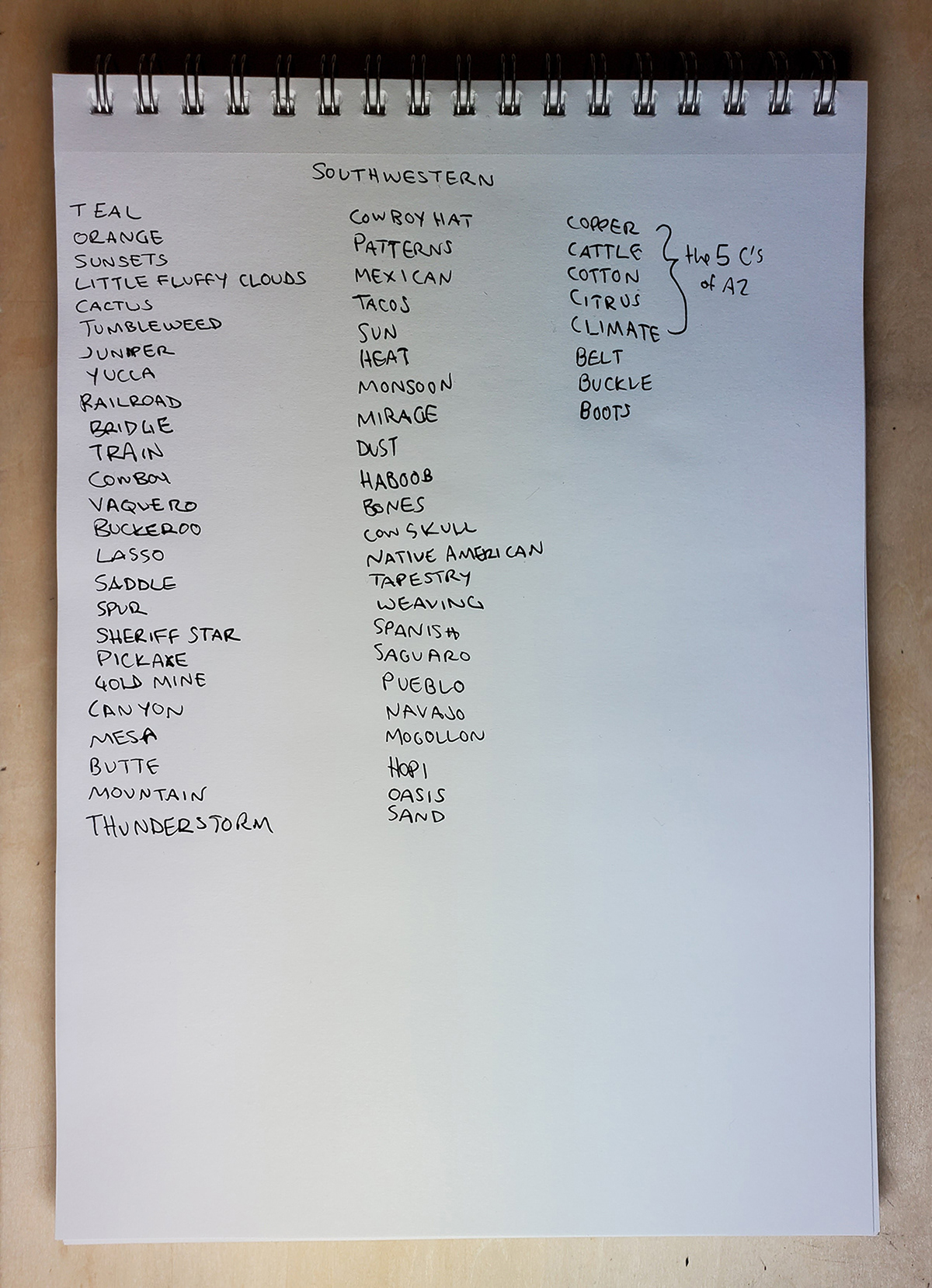
I then developed word lists to explore themes based on Sedona's geography, culture, and the word “southwestern.”
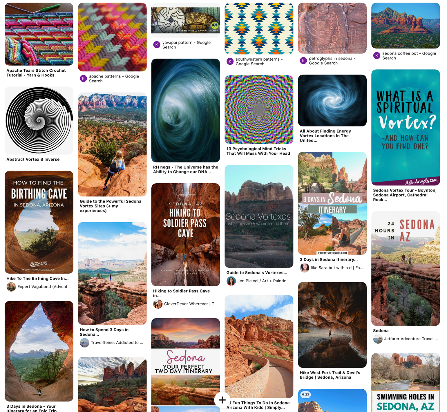
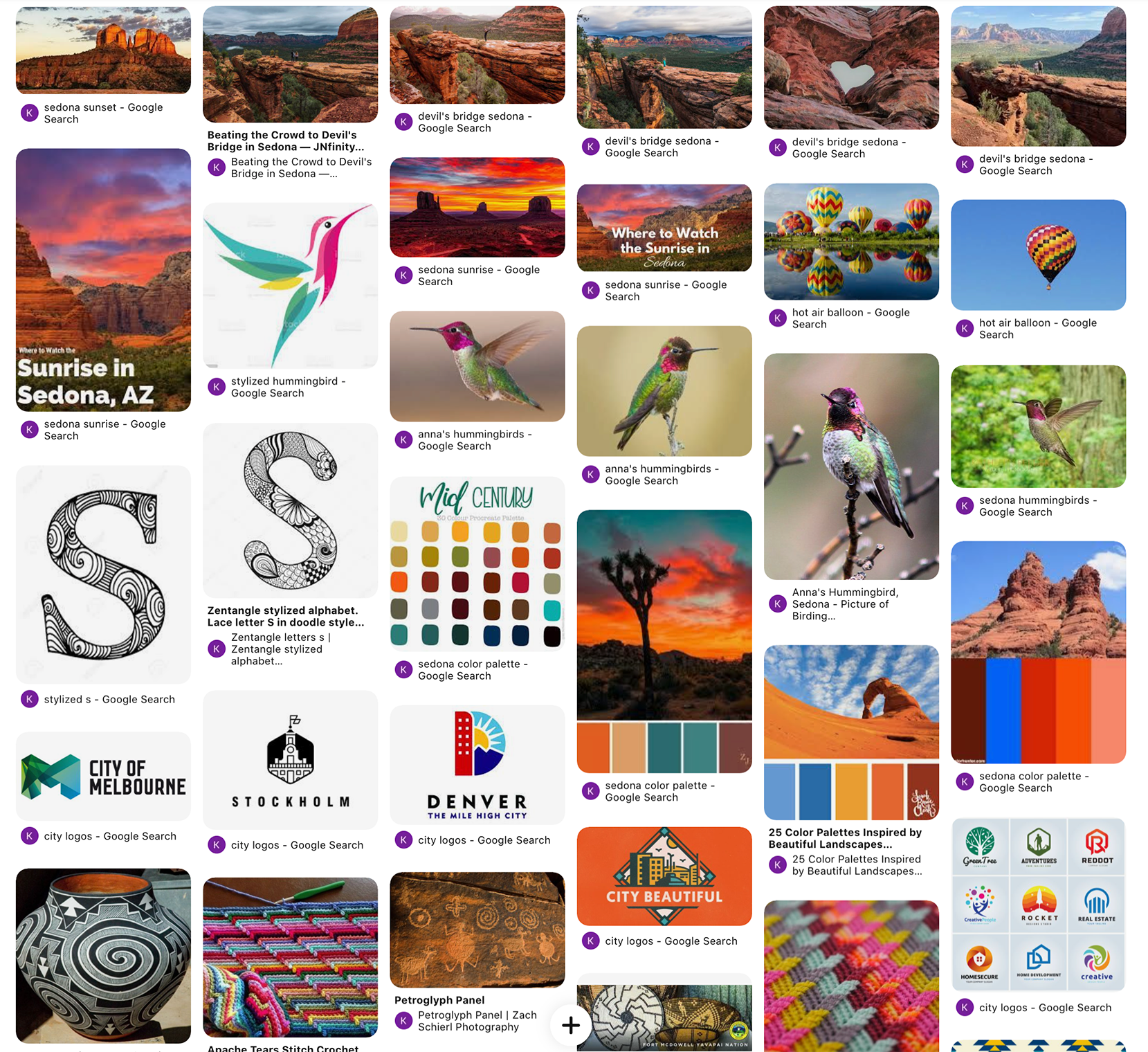
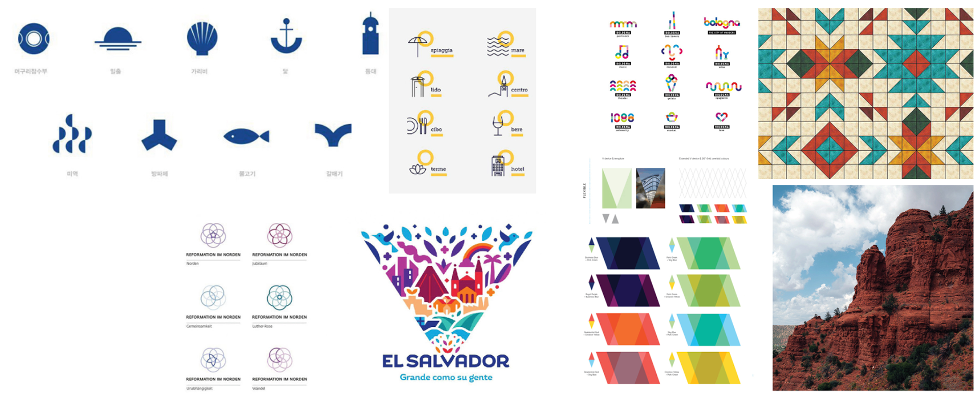
I created a Pinterest board using themes from my word lists, colors, and other city logos and branding.
The themes I chose to move forward with were mainly based on nature and history: hummingbirds, agave plants, rock formations, petroglyphs, and sunsets.
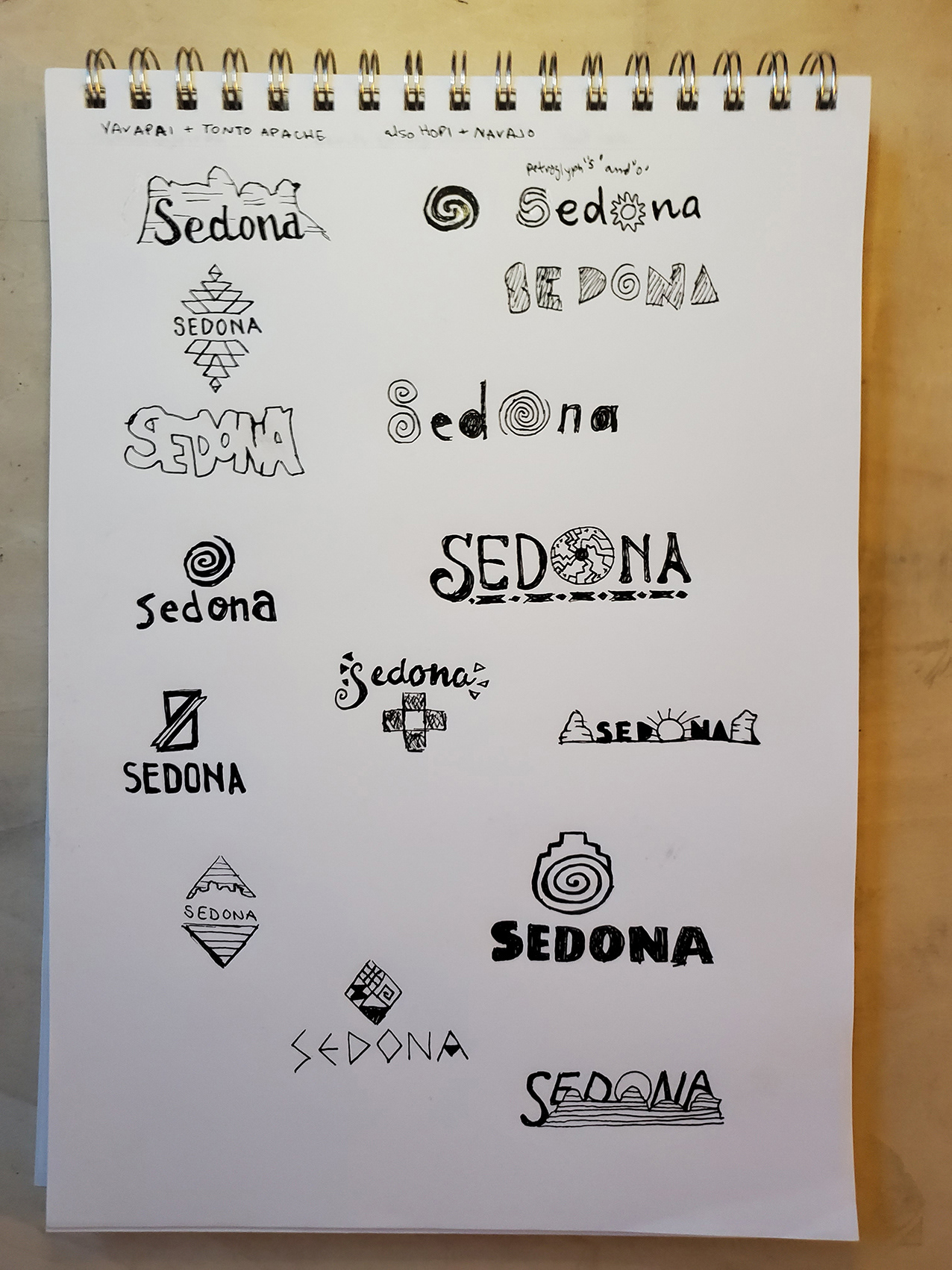
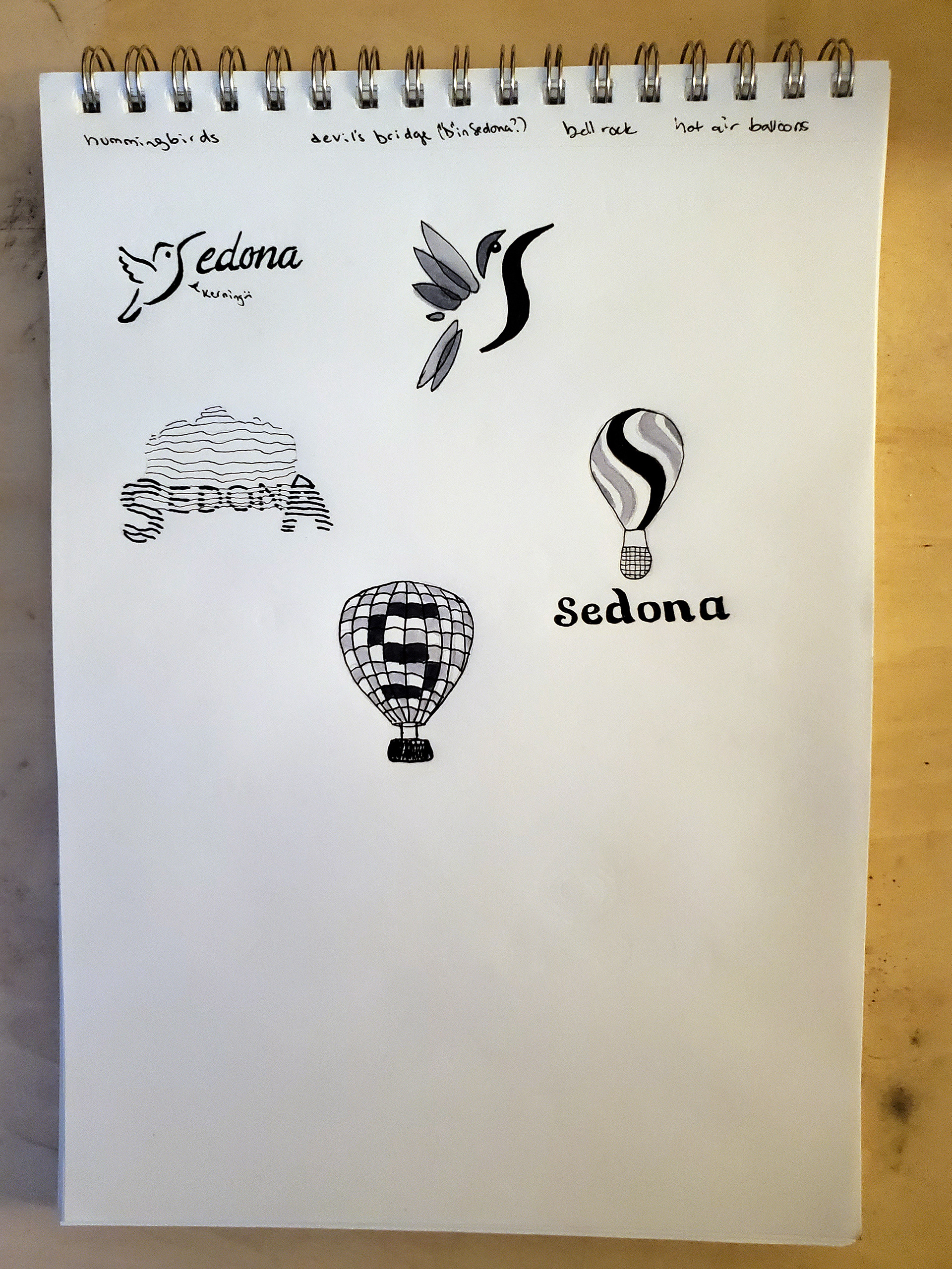
Logo Concepts
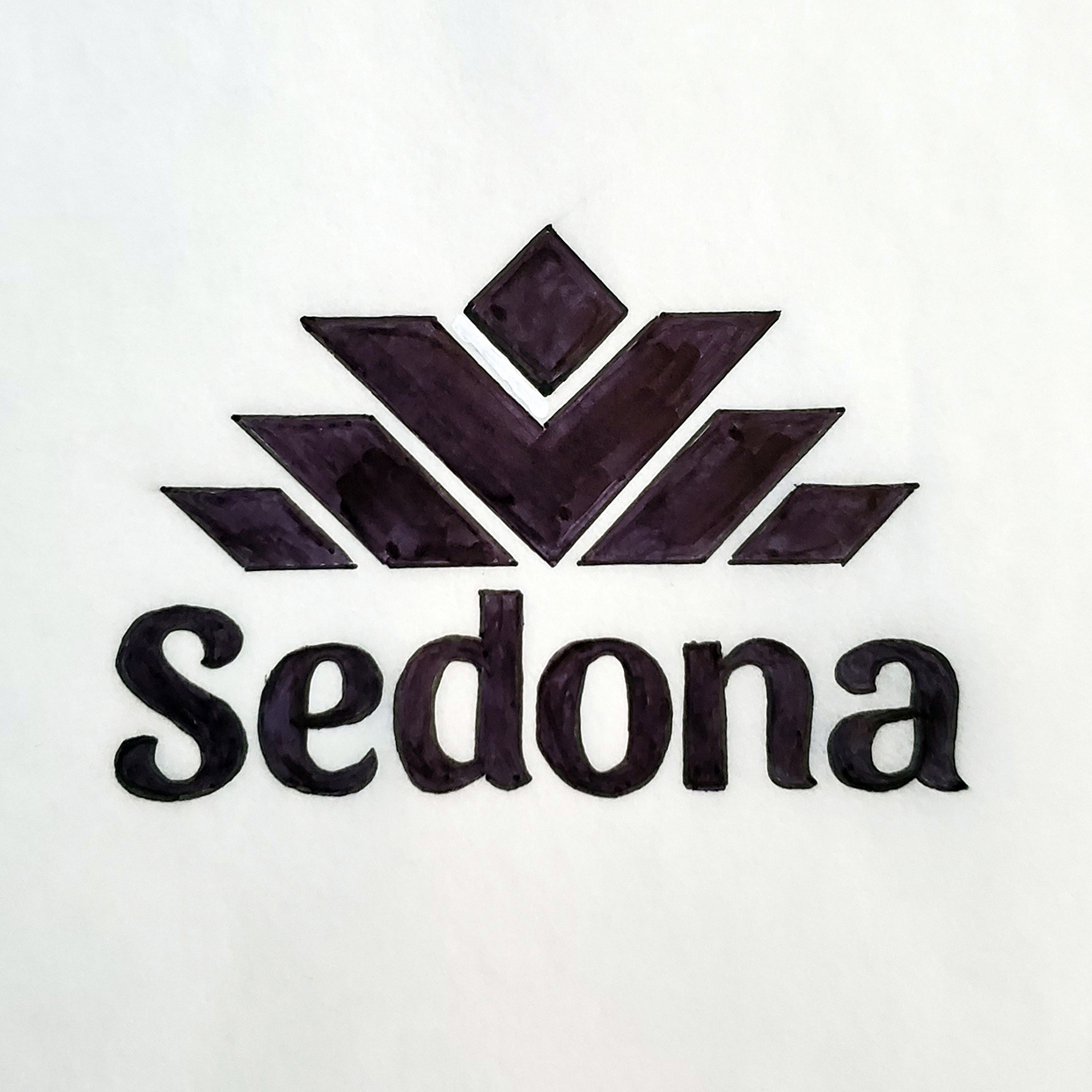
This combination logo is a representational agave plant in the style of southwestern textile patterns, with a playful yet modern sans serif typeface.
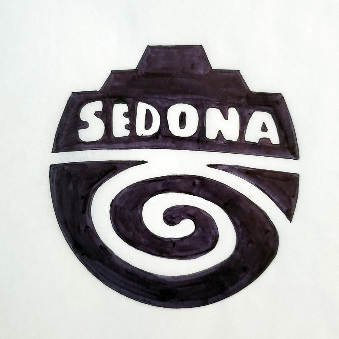
This concept combines Sedona's red rock formations with a spiral motif that can be found in nearby petroglyphs and traditional textile patterns. The spiral can also represent the energy vortexes said to be common in Sedona, and a winding path such as a spiral labyrinth. The lettering is bold but plain to represent both the weight of rock and simple, iconic petroglyph symbols.
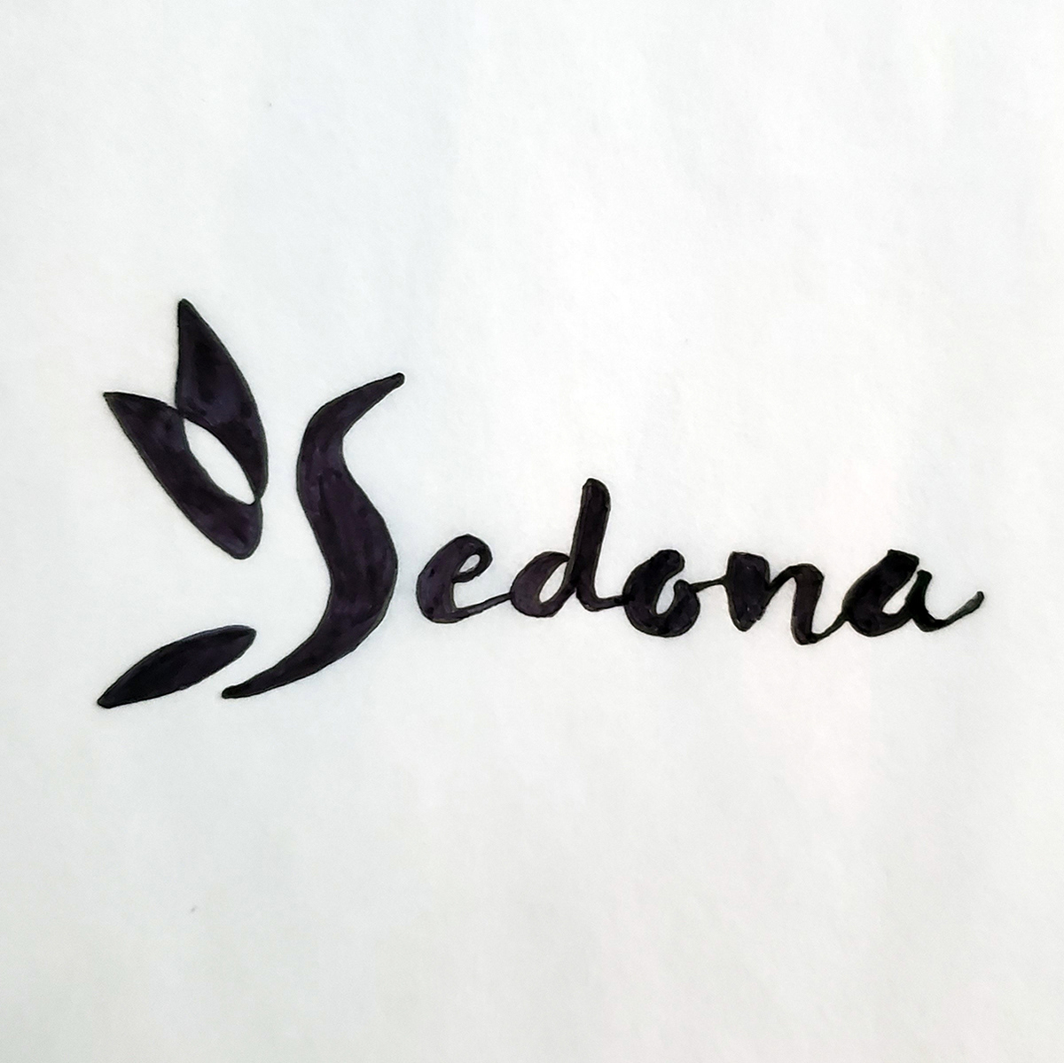
For this concept I wanted the S to represent a hummingbird but abstracted as much as possible. The S and feathers could stand on their own as a lettermark. The lettering suggests brushstrokes and a messy, creative feel.
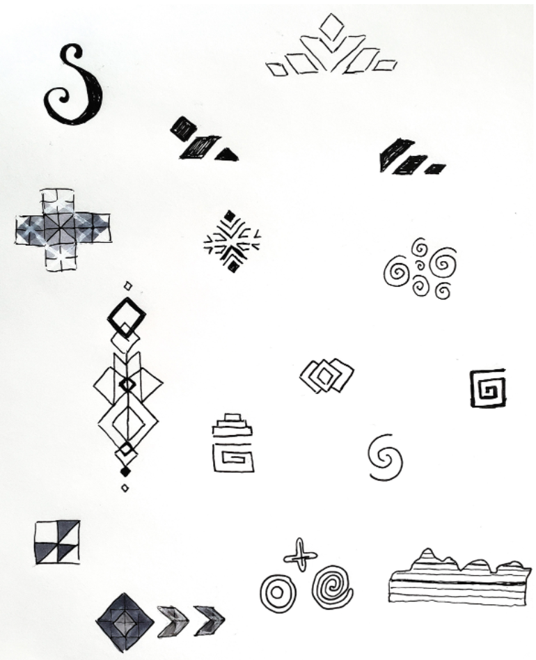
Rough Vector Logos


Refining the Logo


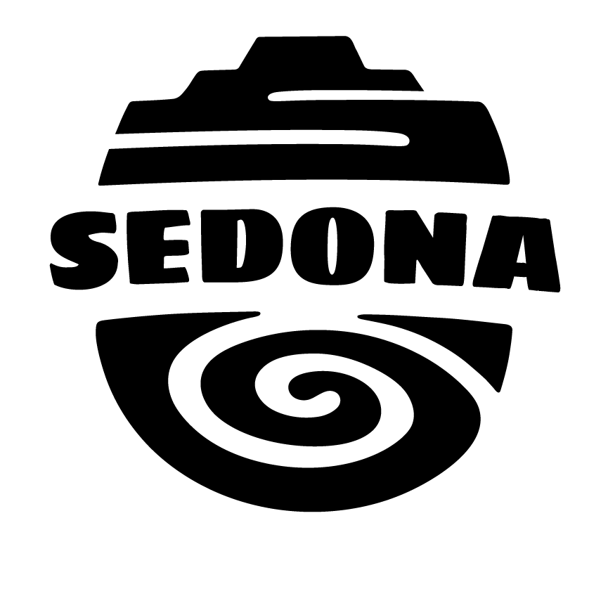
The final logo design is an emblem—the top is a stylized letter S representing the striped red rocks, and the bottom is a rounded spiral shape representing vortexes, traditional iconography, and a path of self-exploration.
After the logo was fully developed, I did more research on patterns, colors, and icons in order to develop the visual theme that would be used throughout Sedona's branding.
I continued exploring spiral motifs, along with southwest textile patterns. Texture was added by making bitmaps of sandstone photographs and layering them using blending modes.
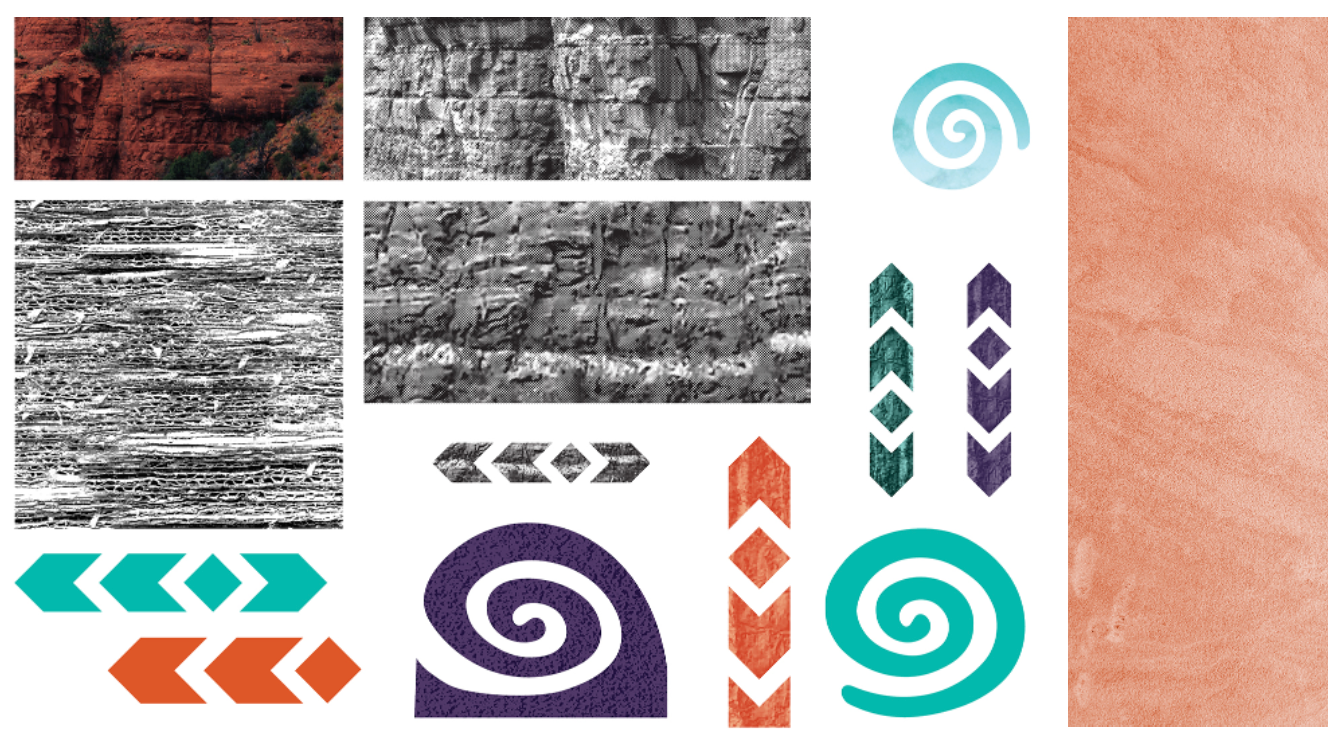
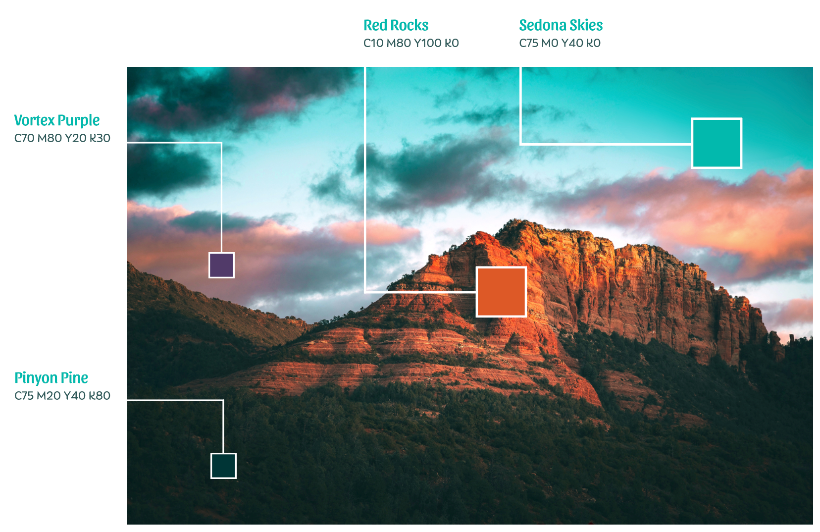
Color Inspiration
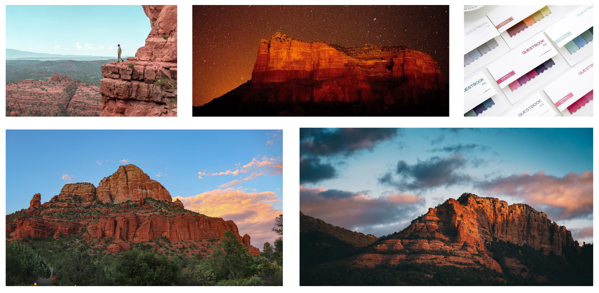
The brand colors are sourced from the natural beauty of Sedona. The two primary colors reference the red rock formations surrounding Sedona and the Arizona sky above them.
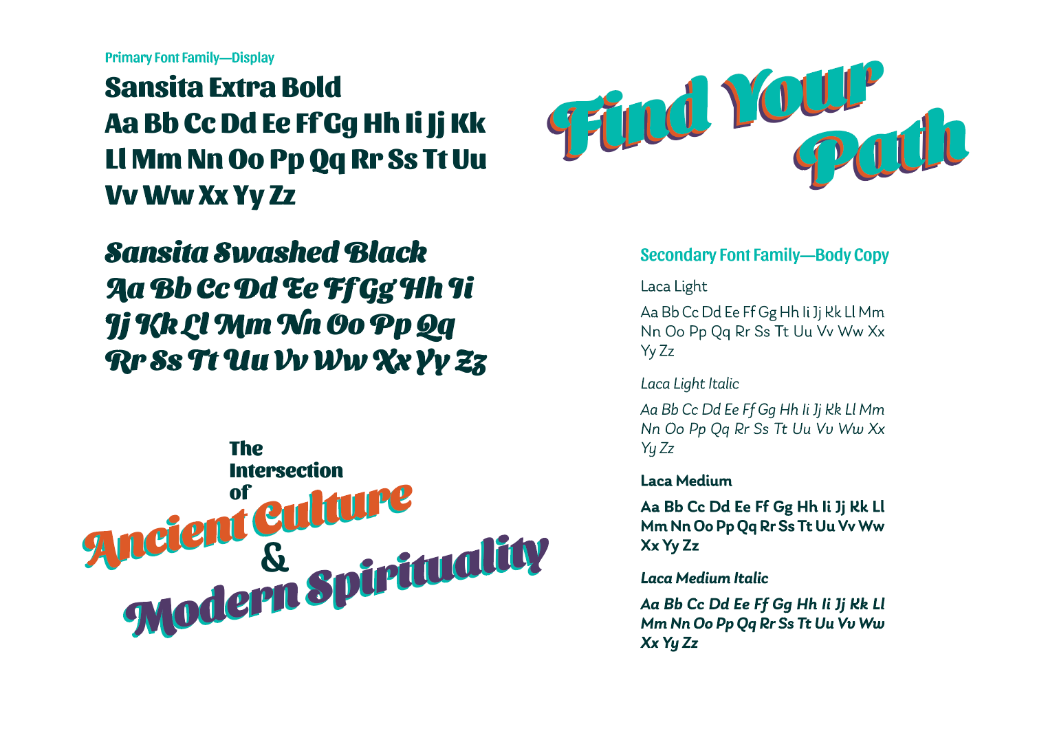
The display typefaces, Sansita Extra Bold and Sansita Swashed Black, belong to a modern sans serif font family that has thick-thin stroke variations and decorative elements and swashes, much as a traditional Western style font would.
The typeface used for body copy, Laca, was chosen due to its readability and simple yet playful nature, which pairs well with the Sansita family.